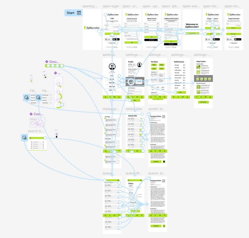
As someone who is constantly checking job posting websites, I found that there are a lot of these interfaces that could use a tune up. As much as I love the idea of these platforms, a lot of the time they are hard to navigate as a first time user. I wanted to take the already-existing interface, ZipRecruiter, and build upon the app to create a more user-friendly experience. Check out the working app here.
Wireframe
Before diving into a Figma project, I always like to do a wireframe to sketch out my ideas. This project was no different. I wanted to create a general layout to plan out each page of the app; this required a lot of research into other apps to see what worked and what created the best user experience.
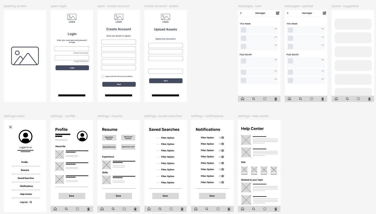
Login Pages
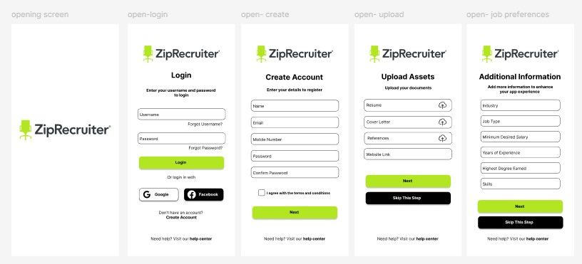
The most natural place for me to start creating this working app was to start with the login page. This was the part of this project required the least amount of complete redesign. This part of the design included condensing information and elements into 5 simple pages, as well as simplifying the design.
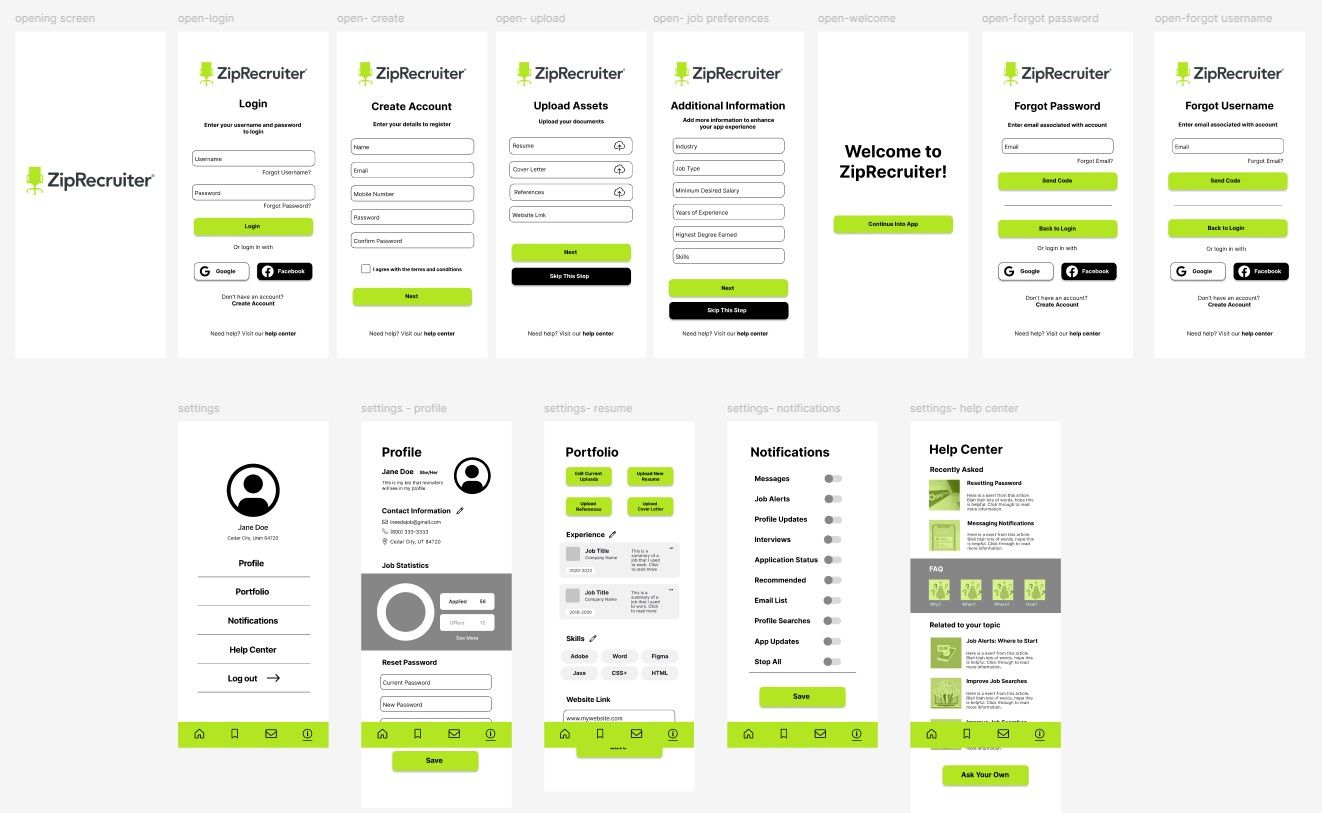
In-App Settings
The settings in the ZipRecruiter app required a lot or reworking. I found it hard to navigate all of the nitty-gritty settings so, again, I wanted to simplify these elements so it was easily digestible for the average user.
Saved Information
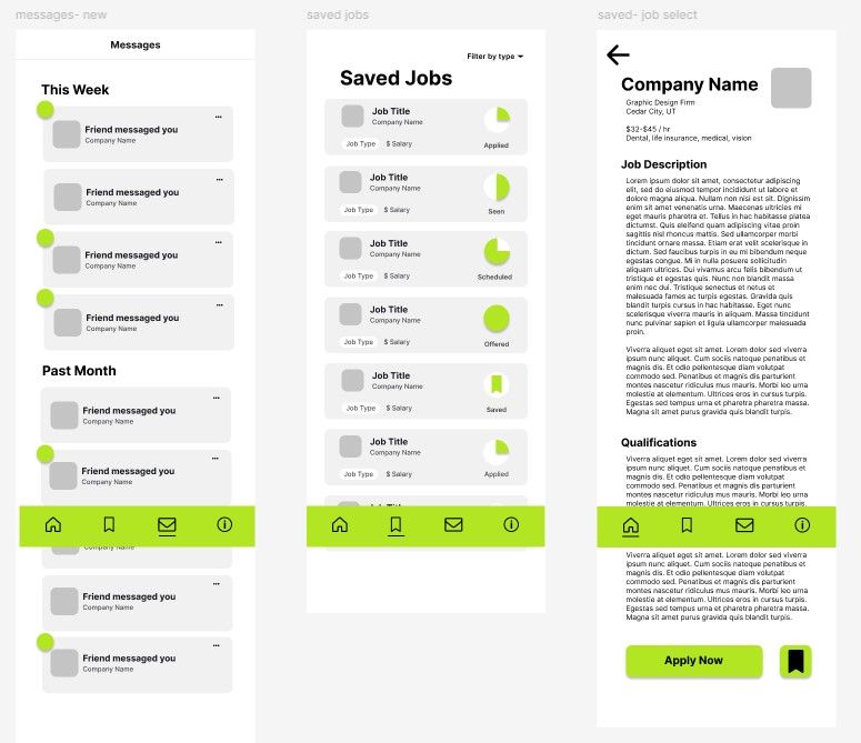
When saving jobs in the app, I found it very difficult to 1. differentiate between jobs due to the spacing issues, and 2. remembering which jobs I had applied for. I love when a job searching process is easy and fair to the person looking for a job. For the saved jobs page specifically, I wanted to be able to see if my application was even being seen by recruiters. This part of job applying can be extremely anxious to the person applying. I thought including a very transparent interface would not only help recruiters when uploading to create a successful job posting, but also help applicants to digest the information in a way that makes sense.
Final Layout
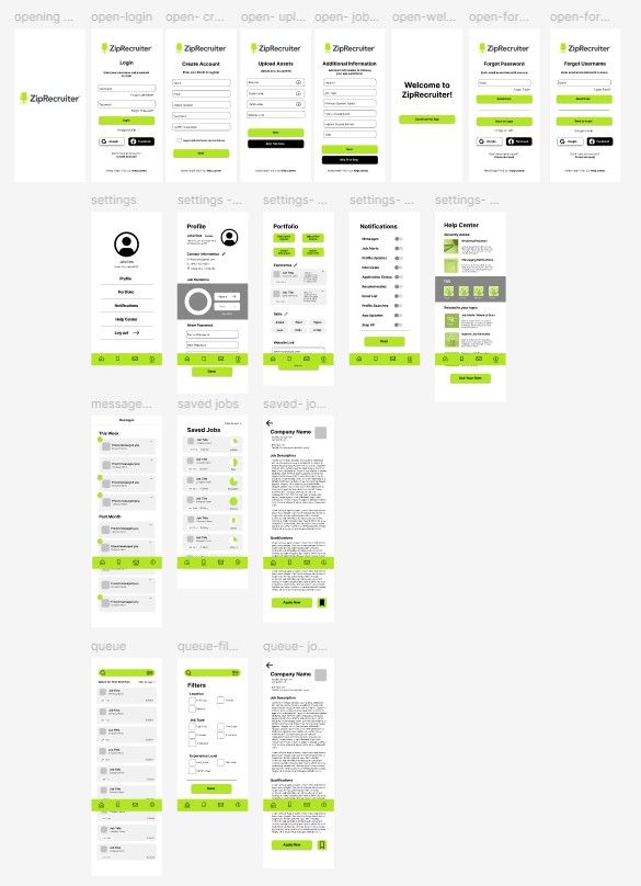
Creating the entire app and looking at it as a whole made me realize that a few things were missing from my design. I added search capabilities on the ZipRecruiter homepage; including job postings with design contrast, a helpful search filter with better options (some that are not included on their current app), and a complete job post page with easy ways to save, and apply for the jobs.
Prototyping
Creating the working prototype is always my favorite part about creating a website through Figma. I was able to create working elements on every page, as well as some cool animations that I think would become a great addition to ZipRecruiter's current app. This part of the project really sold this design for me, because I was able to "use" the app myself to check what I think would be the most beneficial to the design and to the application itself.