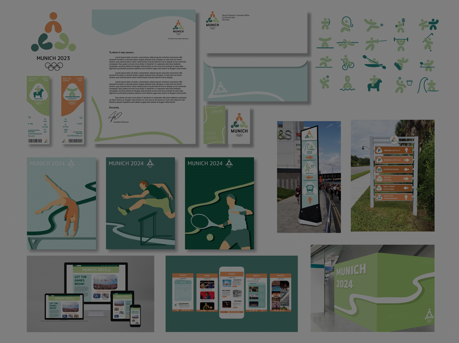
The Olympics is a worldwide event that happens every 4 years. Each year, the host country will create an entire branding campaign for the upcoming games. For this project, I focused on rebranding the iconic 1972 Summer Olympics in Munich, Germany. Using elements from culture with a new unique spin, I was able to create a comprehensive brand campaign for this hypothetical Olympic game.
Enter a Heading

Color Scheme
The colors that I wanted to focus on the most for my olympics were green and blue, with orange as specific highlights. This directly represents the colors and hues found all over historic Germany and Munich (more directly seen in the rooftops of buildings).
Logo Design
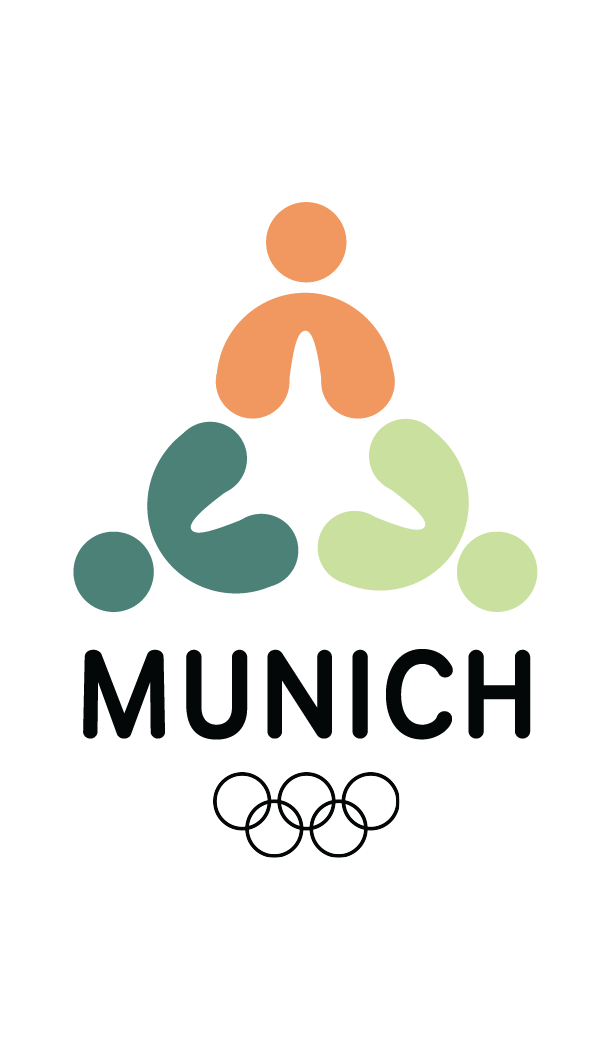
This logo was, originally, based off of a sculpture found in Munich that is supposedly an atom replication. This progressed into the logo that you see, which depicts 3 figures in a circle form. This is to represent the theme of togetherness, while still holding onto the historic elements of the Baroque era (just very very simplified). For the font, I wanted to go with a font that matched well with the rounded edges of the logo.
Identity Systems
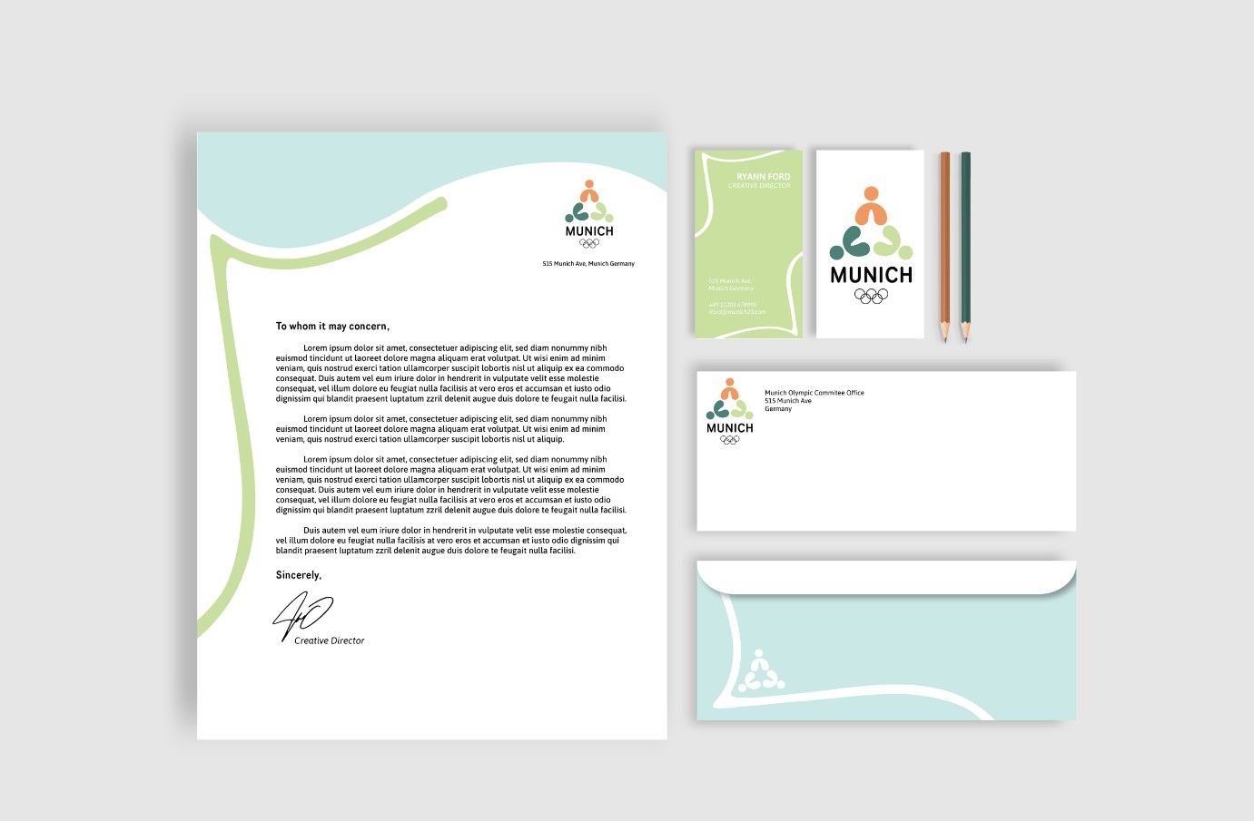
Once the logo was completed, it was time to start narrowing down what the brand was. Keeping the baroque elements in the back of my mind, I went to work drawing and making a plan. In a lot of historical designs from Germany, it included curvy lines and elements, which I decided would be a good addition to the brand identity.
Posters
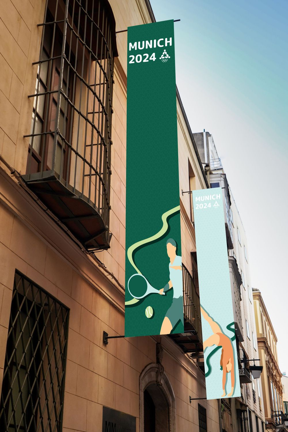
For the posters, I wanted them to have a different look than the stuff I had previously worked on. I decided that using a ton of photographs was not going to be a big part of my brand, unless it was for a website. So I opted for an illustrated look, which kept with my clean feel I had established already.
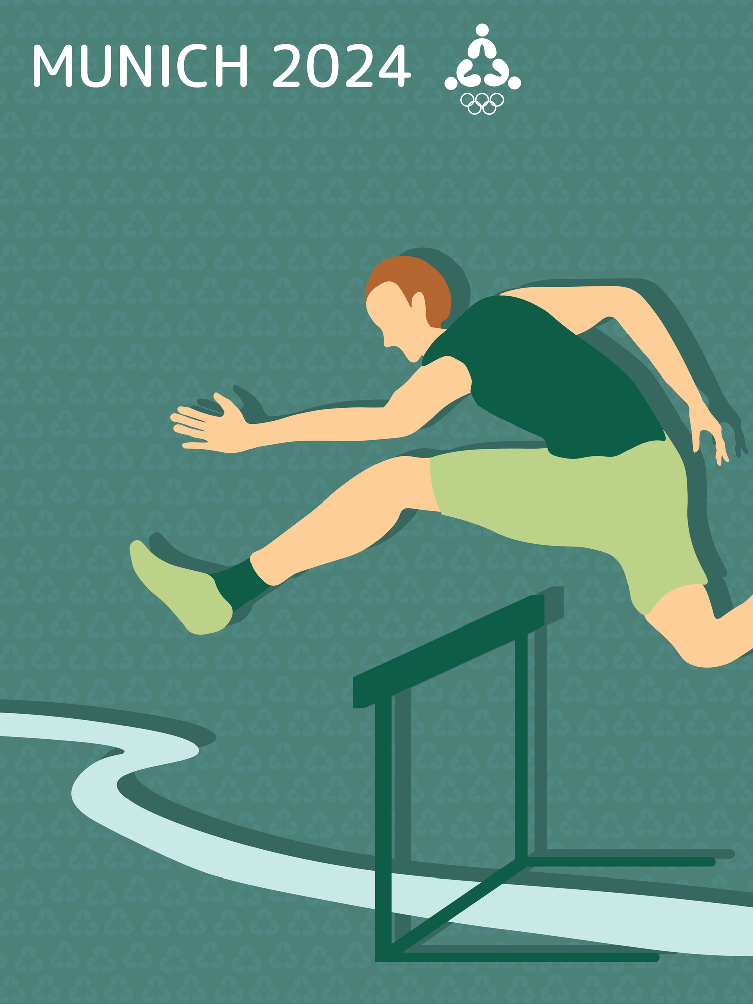
Hurdle
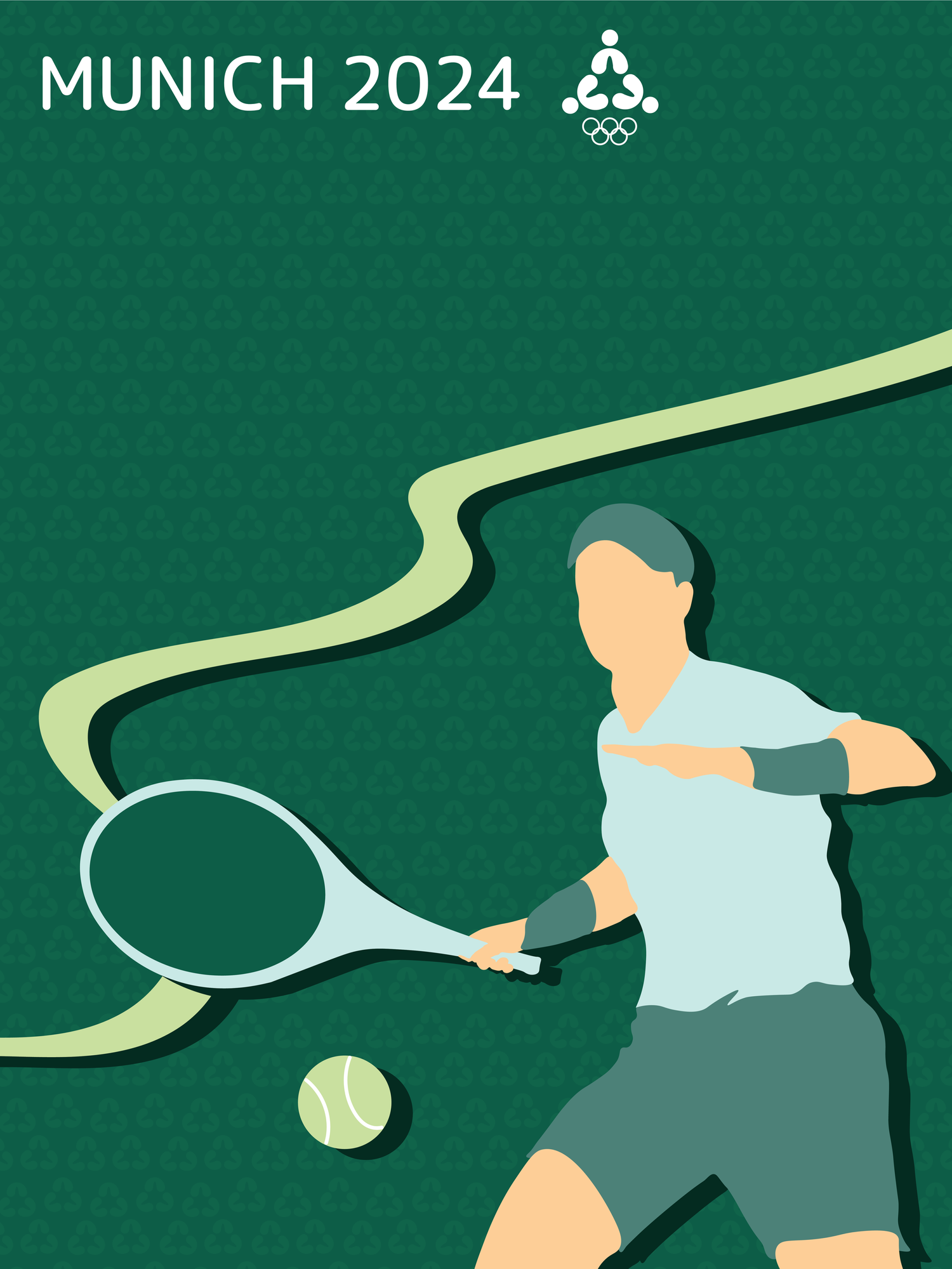
Tennis
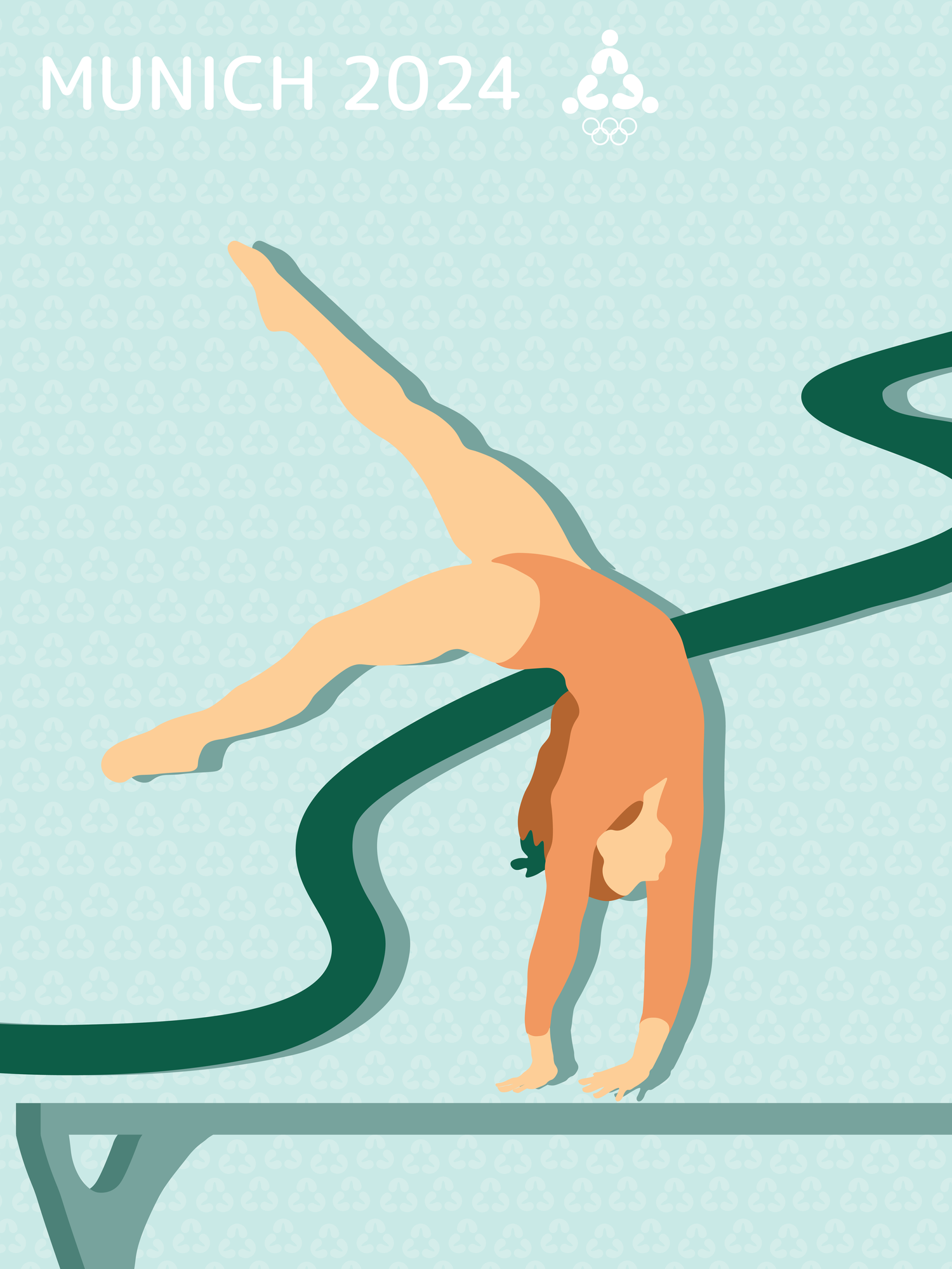
Gymnastics
Iconography
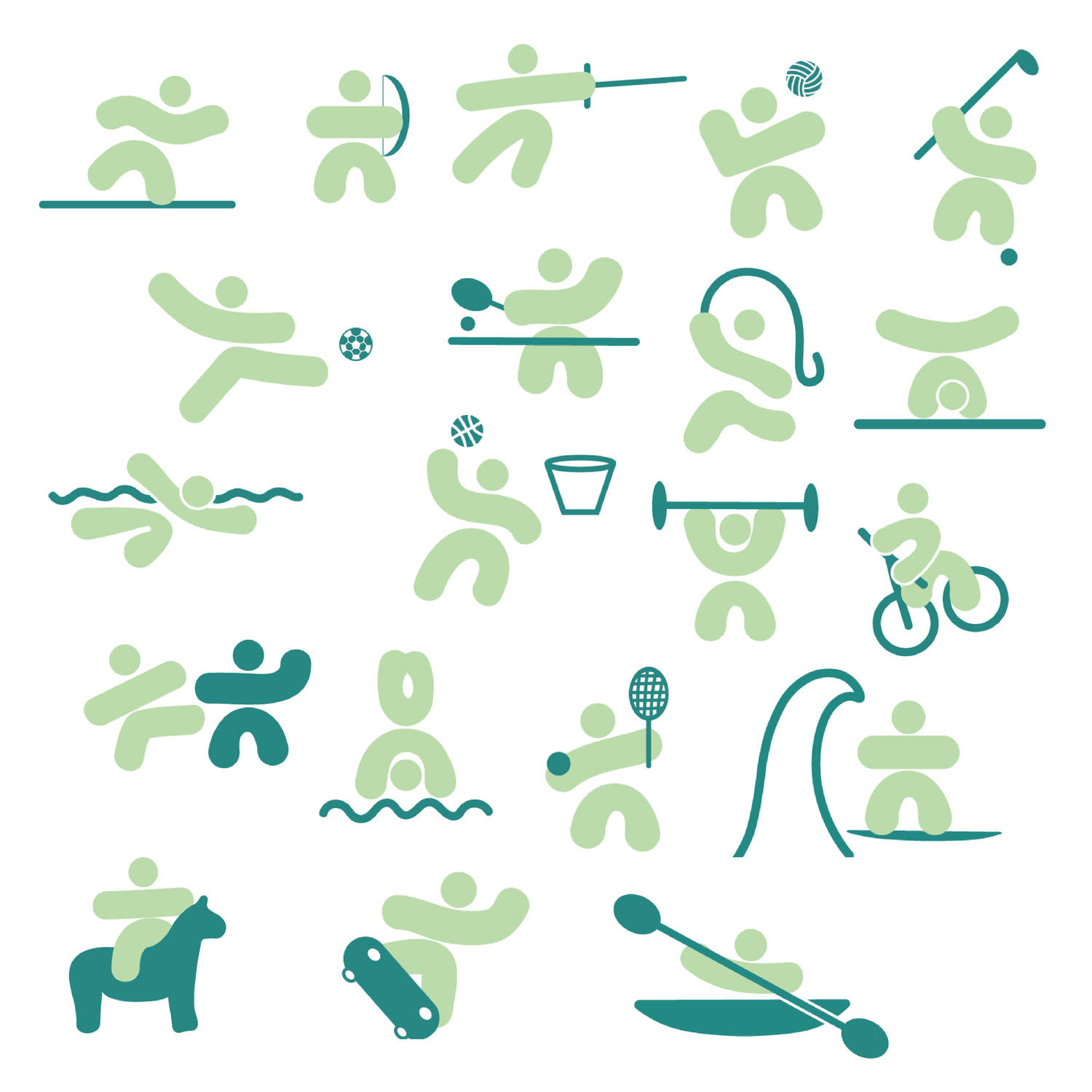
I wanted the pictograms to have a similar feel to the logo itself,
so I made them with the same basic shapes, just with graphically interesting elements. This was one of the easiest parts of this project, because the ideas flowed really easily with my brand identity that I had already created.
Ticket Design
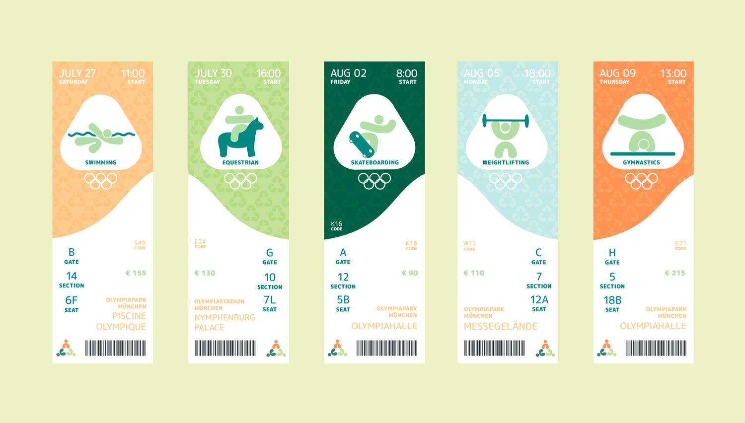
After looking at some Olympic tickets, I decided to follow a similar style, but make it in my own branding. Also opting for using my pictograms as the hero image instead of a photograph. I used real places used during the original Germany Olympics from the 70’s.
Olympic Website
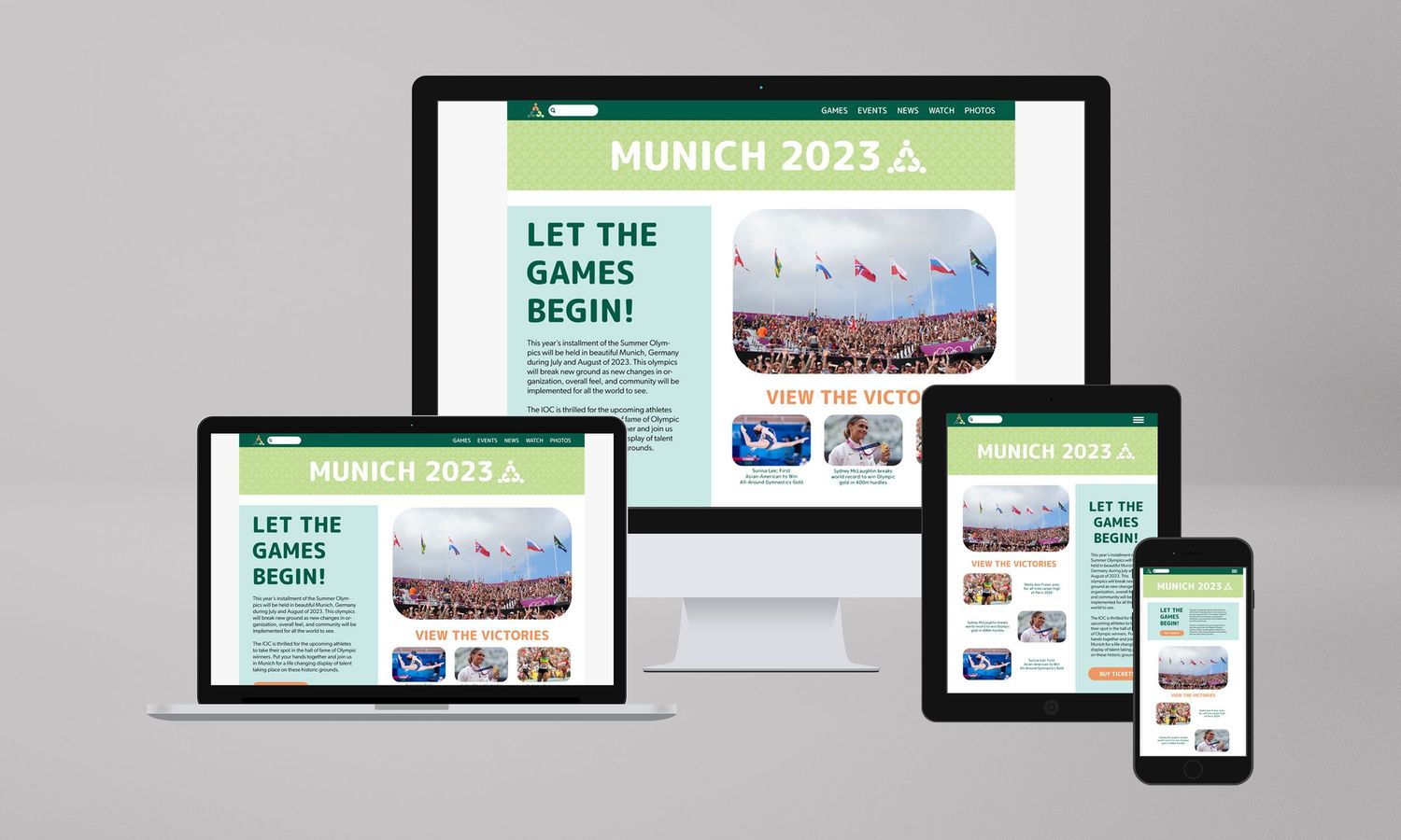
This is the only part of the project in which I used photographs, because a website without photos sounded too bland to me. I wanted to amplify the work I had already done by creating fun new layouts and designing parts that I hadn’t thought of until this part. It was challenging to try to think in more of a marketing sense and less in a fun design sense.
Olympic App
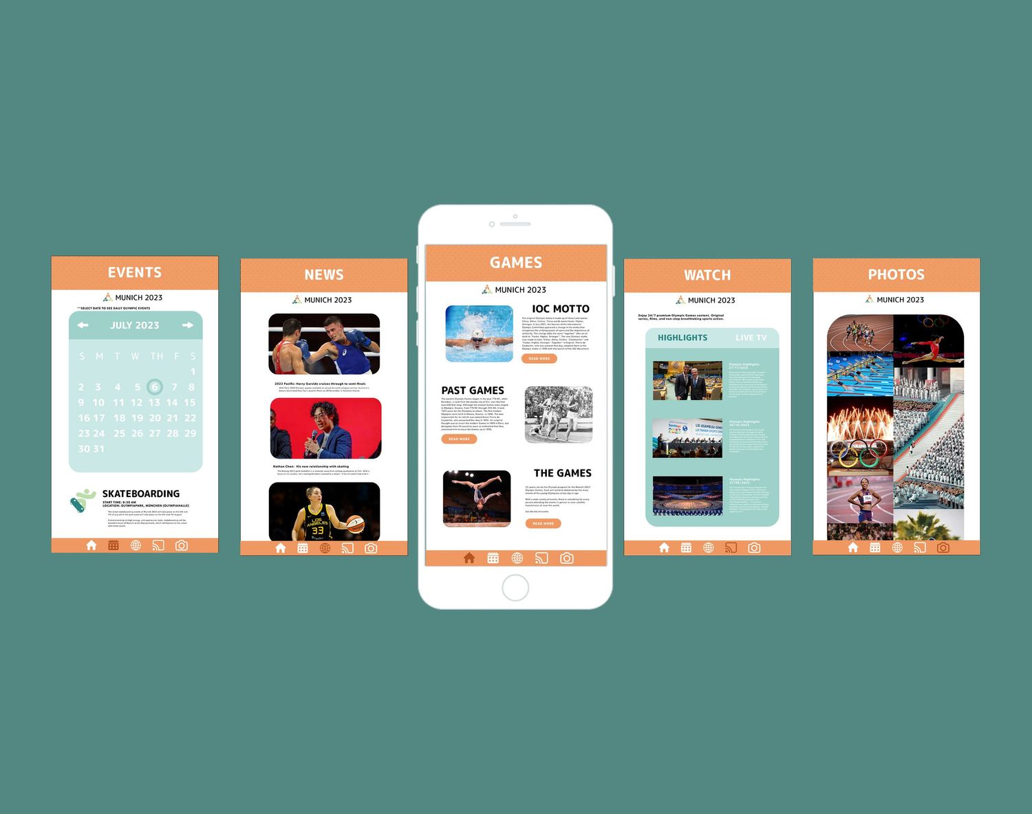
Similarly to the webpage, I wanted my Olympics app to have a playful but professional feel while sticking to my branding. I tried a lot of different styles, and looked at a a ton of reference pictures from other apps created for olympics and landed on this design.
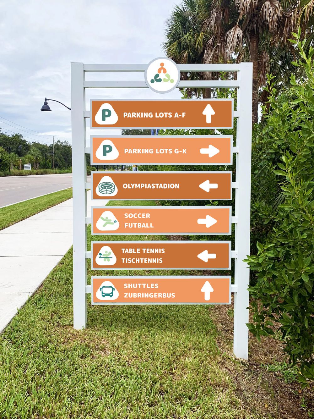
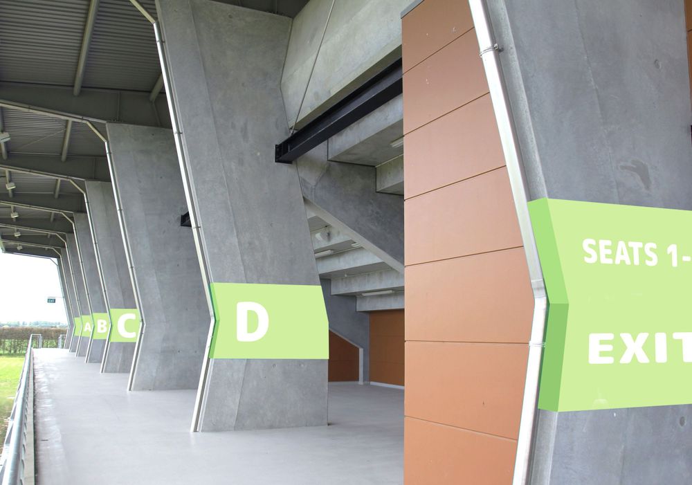
Wayfinding & Signage
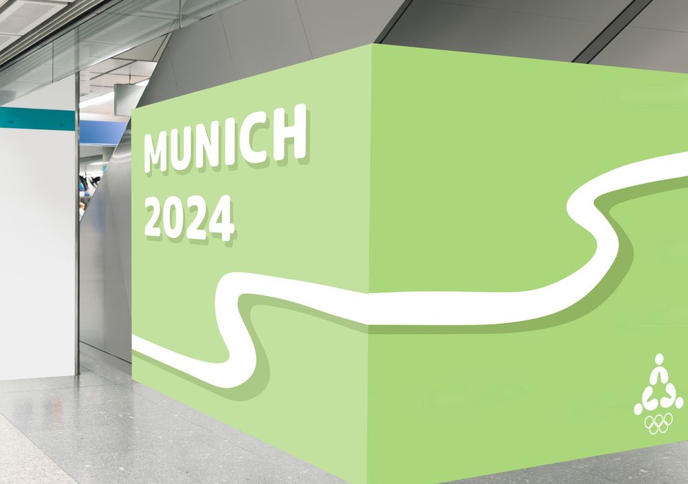
Creating the wayfinding and signage for this Olympics was also a very fun part of the project for me. I got to use some of the materials I had made in the earlier parts of the project, while being able to add some more content into the brand identity.
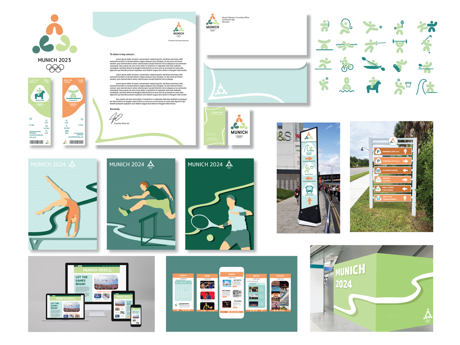
Finalized Project
Overall, this was a very challenging but fulfilling project. But I am very proud of how it turned out. I am happy with the brand I created from scratch and it has opened my eyes to how hard other designers work to make things like this every day. I think even though my project ended up being something a little different than how I originally planned, I prefer it this way as opposed to the super detailed option from the beginning. This is my first attempt at a brand identity design project and for a first try, I think it turned out very well.