For this creative project, I worked with a fellow graphic designer friend, Grace Walter (@gracewalterdesign). Together, we wanted to do a complete brand redesign for Gold's Gym. After doing some research, we discovered that their company is going through some financial hardships due to the after effects of Covid. We wanted to change a few things to *hypothetically* set them back up for success in the future. This brand design includes new logos, colors, typography, photography and merchandising. To view the whole Brand Guide, visit this link.
Market Research
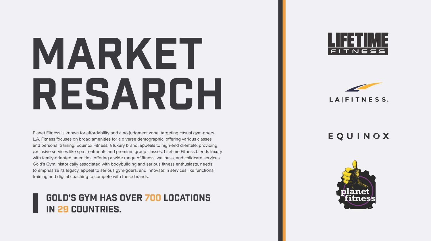
Before we started designing, we wanted to see who were our biggest competitors. In our research we found these 4 brands have the most in common with ours (thus becoming our biggest competitors). The one thing we found, is that Gold's Gym is marketed as a body-building gym, as opposed to these others. Through this research, we found what makes our company different than the rest and built it off of that idea.
Primary Logo
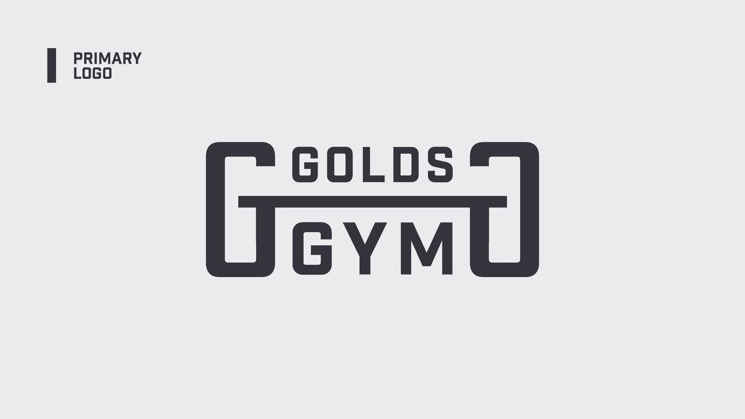
We wanted to keep our primary logo bold and in theme. Since Gold's Gym is, indeed, a gym, we wanted to see that in our logo without it being too obvious. By taking our "G" and stretching it, we created a abstract weight icon to balance out the words in this logo.
Word Mark
If the weight motif is too much for you, this wordmark is the answer to your prayers. We wanted a simpler version of our primary logo, but with a more interesting shape. By curving the edges of the rectangle, we were able to create a unique and dynamic word mark that could be used on any format.
Monogram Logo
This logo was created to give our brand ability to have logos in different orientations. The vertical look can be used on any vertical format. We took the original "G" in our logo and continued the notion of weight-lifting by creating a weight out of negative space.
Historic Badge
We didn't want to rebrand Gold's Gym without paying homage to the most iconic mark of their current brand. Using their old badge as inspiration, we created a new and improved badge. This mark also connects to our other logos with using the basic shape of a weight plate that you'd see at a Gold's Gym.
Primary Typography
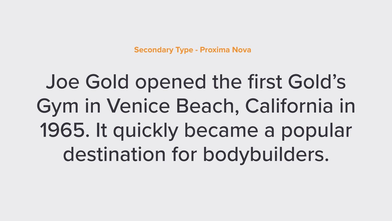
To compliment the boldness of our brand, we wanted a typeface that would stand out on any kind of marketing or merchandise. "Industry" was chosen because of it's boxy & strong shape that we felt exemplified that idea.
Secondary Type
"Proxima Nova" was chosen due to its diverse amount of variations and general complimentary aspects next to industry. The build of the letters is very similar to Industry, which is something I find important while choosing a typeface.
Color Palette
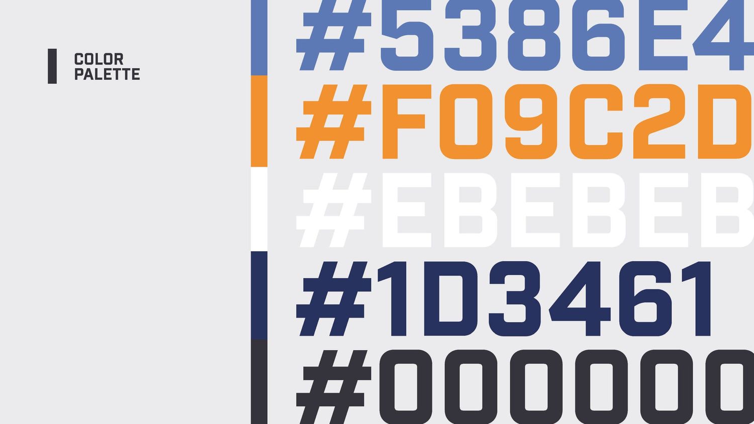
We wanted to keep the basic feel of the original color scheme, but add our own fun and unique twist. A lot of other fitness brands opt for reds, so we chose a blue so that our new brand would stand out. The other colors were chosen to compliment the other colors, as well as the photography.
Photography
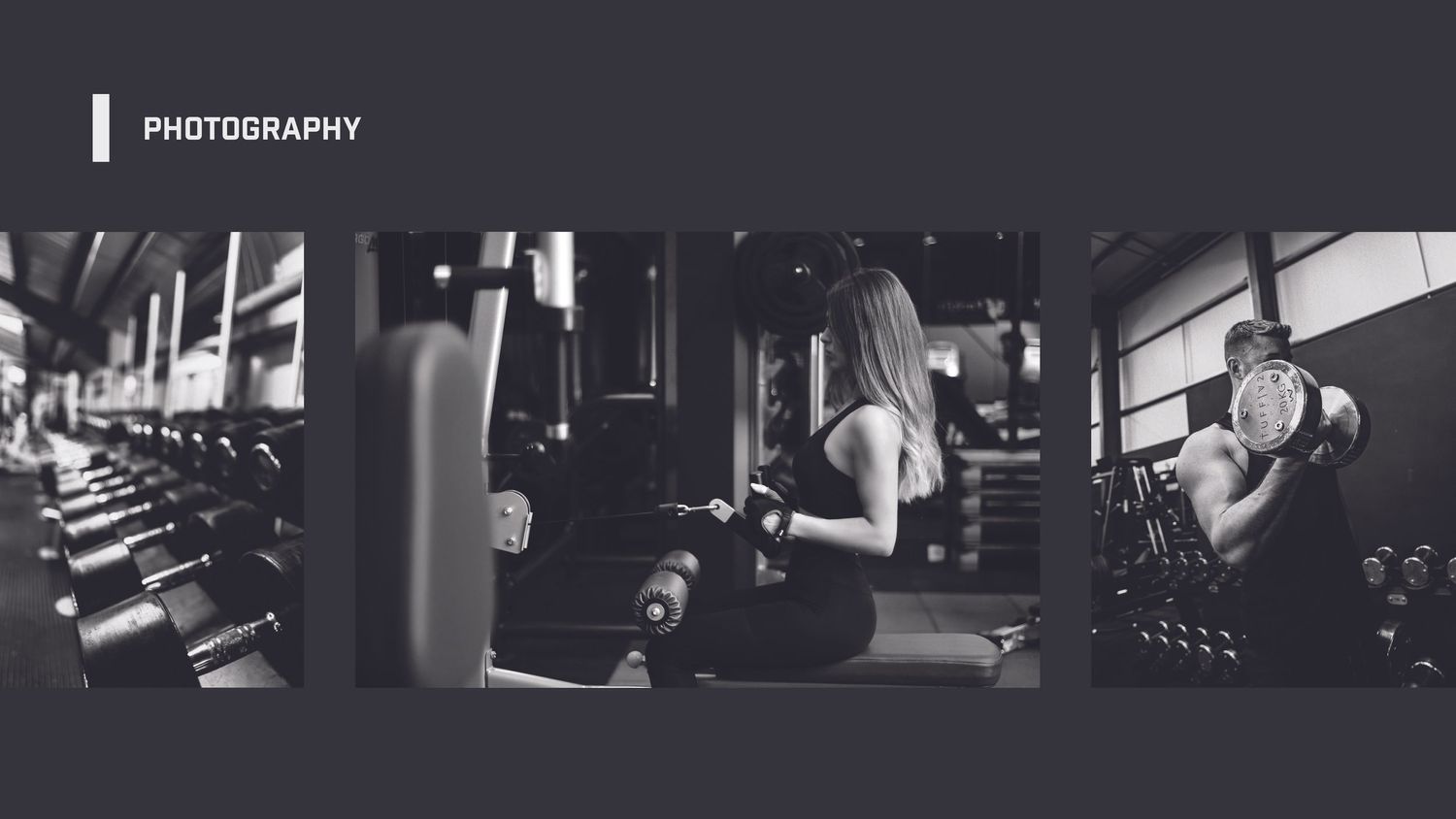
To clean up their social media presence, we though that creating a cohesive feel between all of the images would be a good start. We wanted the emphasis of our Gold's Gym to stay on the bodybuilding aspect, so we included imagery to reflect that. All photos were put through a custom monochromatic preset in Adobe Lightroom.
Brand in Action
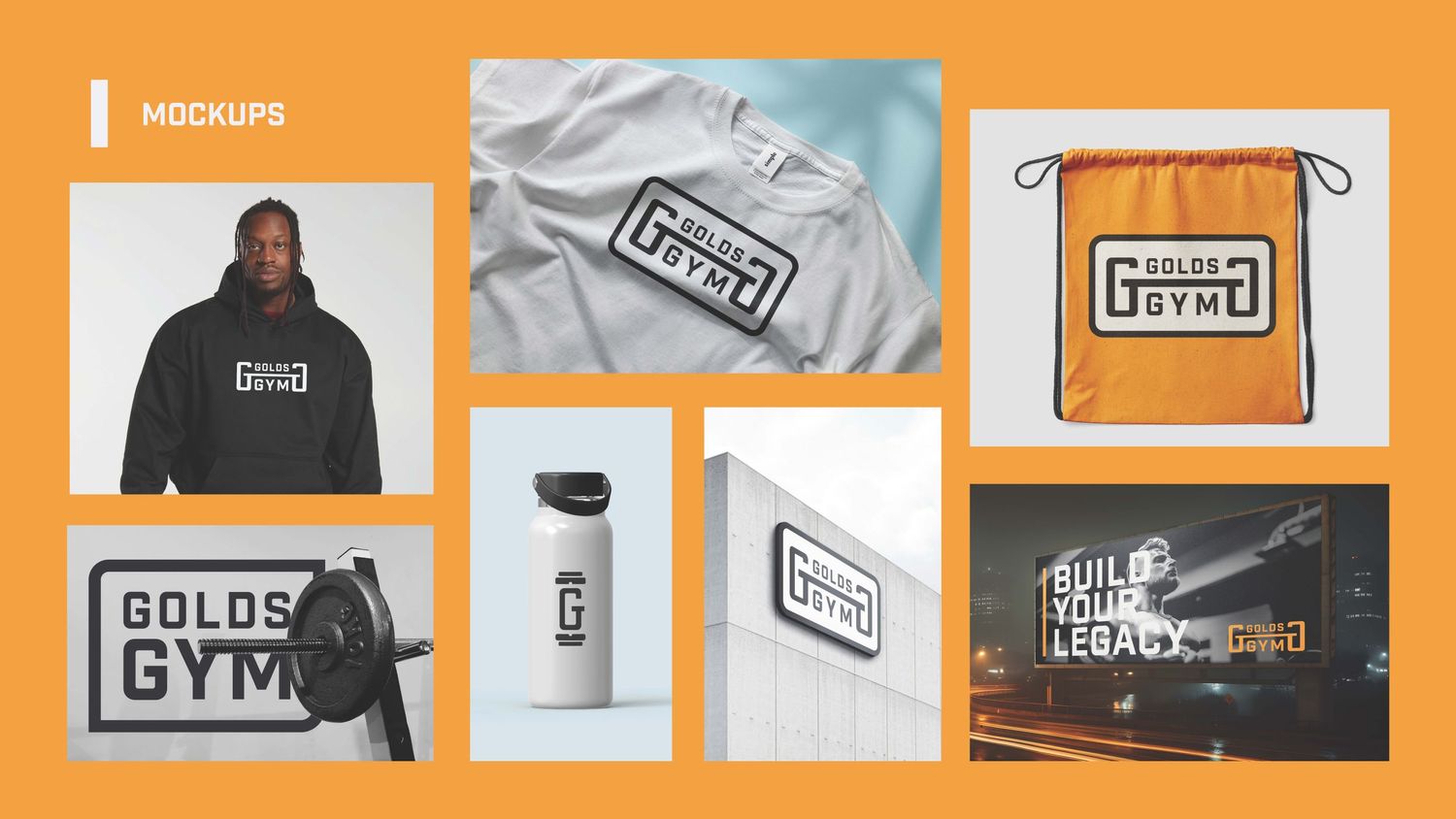
Physical representations of brands are a great way to show your brand is working in the context you're meaning it to. For Gold's Gym, we chose elements that you would see if you walked into our gym. This includes merch, signage, and marketing elements.